Tutor Orial
Fall 2021
Duration: 8 weeks school project
Role: UX/UI designe, researcher
Goal: Improve their online flow
Background information
Tutor Oriel is a new tutor agency for high school and college aged students that specializes in finding fun and friendly tutors that help students learn.
They launched their online flow about a year ago and have very low completion rates. They have gotten a lot of complaints and bad social media reviews about how confusing the process is. The business is struggling and many tutors want to leave because they are not seeing enough clients.

RESEARCH
Original flow- usability

Problem
How to design a smoother and more visually appealing website to attract more customers to book tutors through the website?
IDEATION & SKETCH
Sketch 1
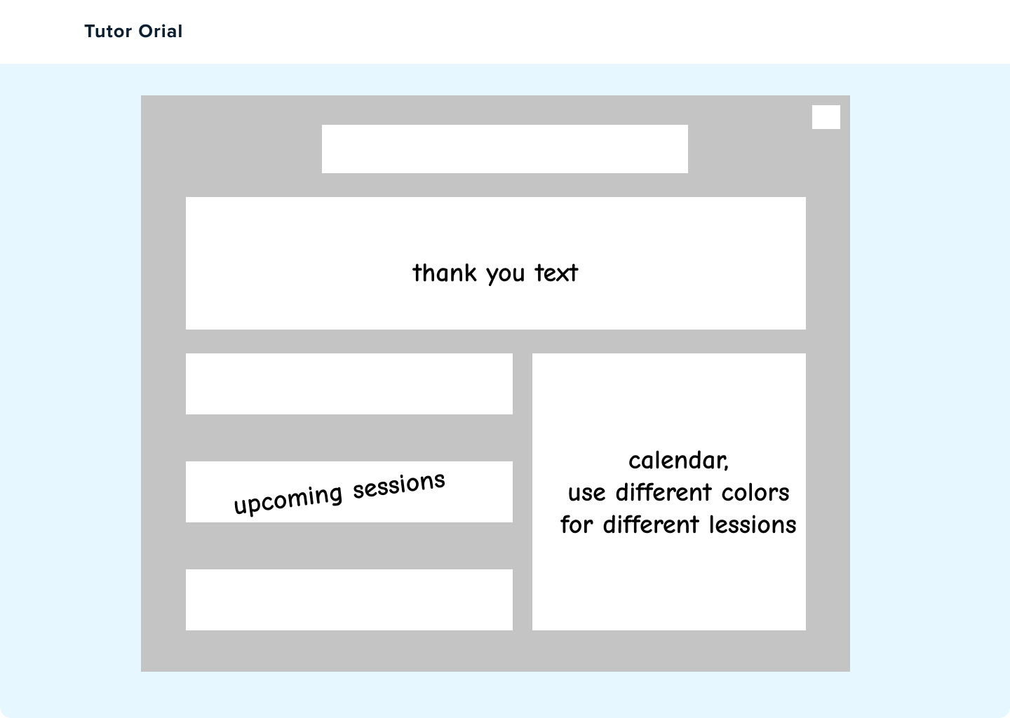

The first sketch detail is that if they click the start button, it will jump to the login page, and if you don't have an account, you can click sign up, and then it will go to the Sign Up page. And for the landing page has a search bar, which allows you to search for any tutor or subject, and there will be some frequently searched words below. Lastly, Upcoming lessons are added below the confirmation page, as well as a calendar with different colors for the different lessons.
Sketch 2
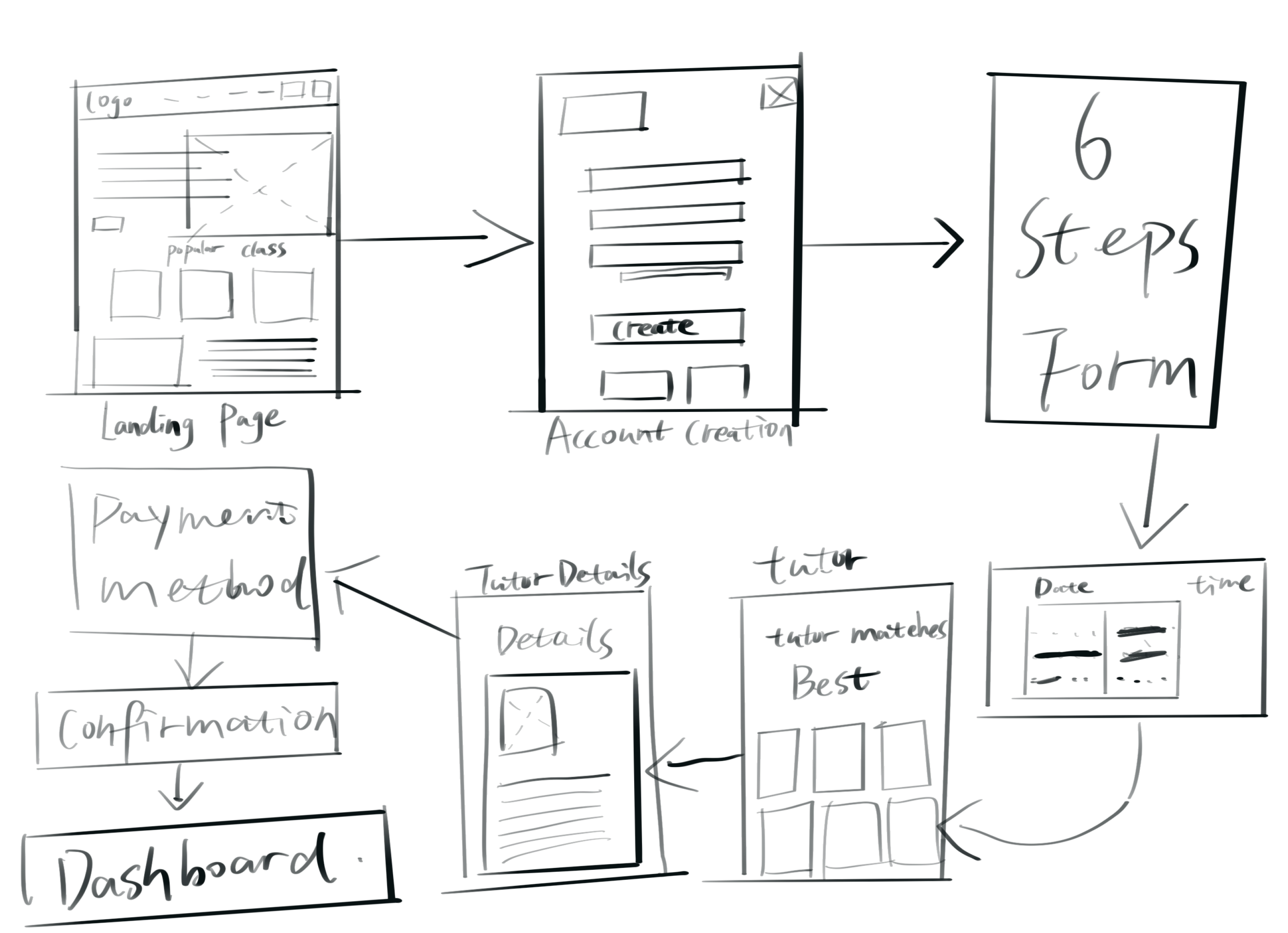
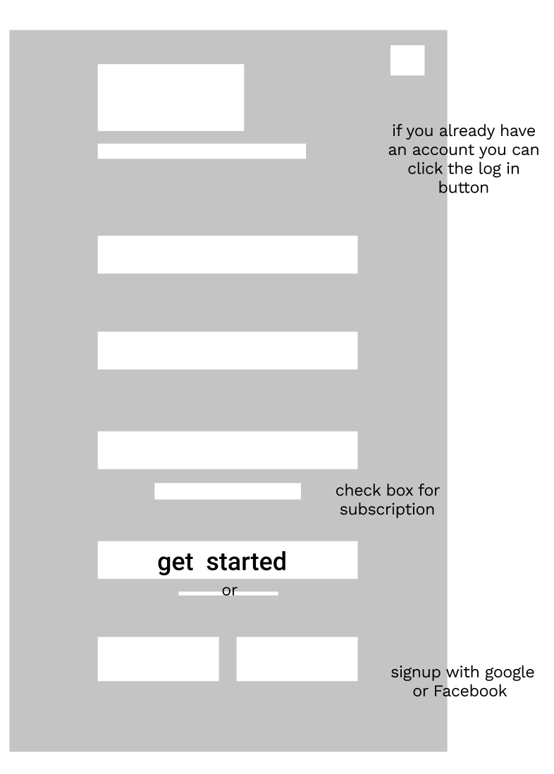
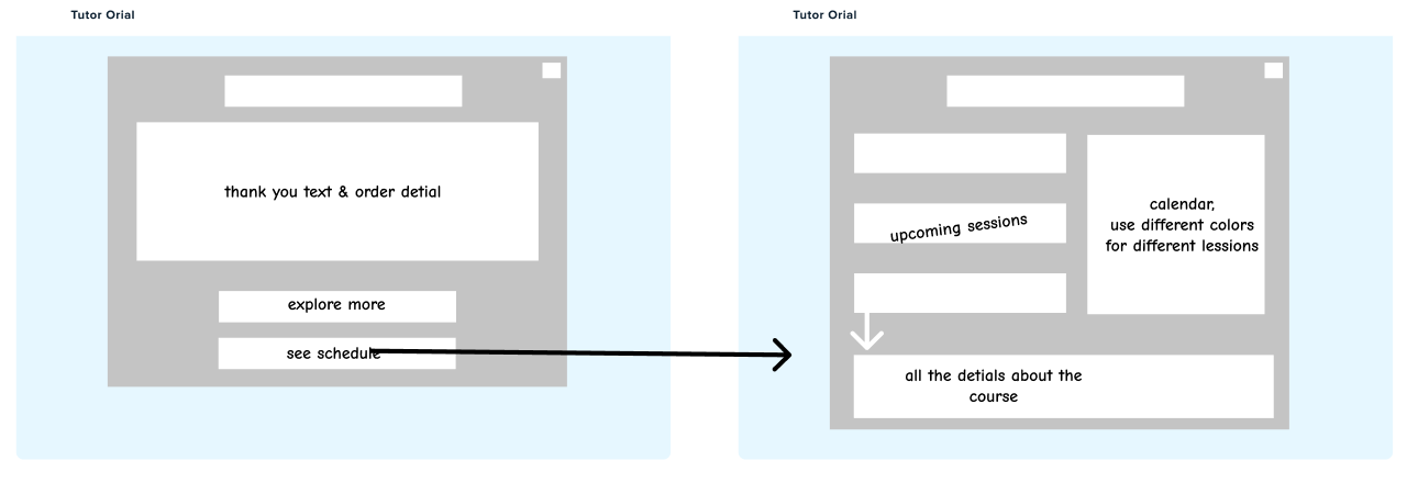
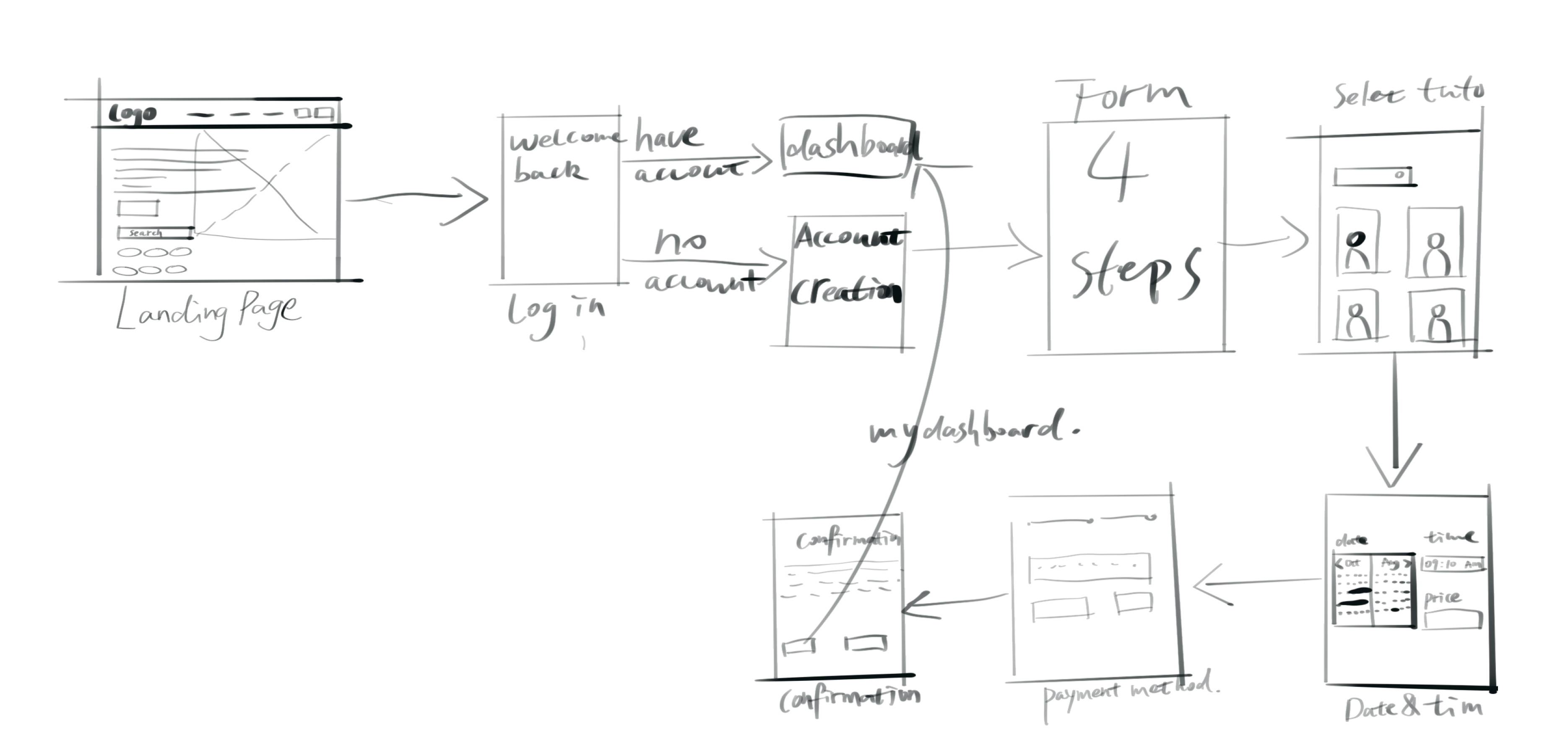
Unlike the first one, clicking the start button will lead you to Sign up for an account, if you have one, you can click on the sign in below to jump directly to your dashboard page. Then is the confirmation page, after successful payment, you need to click on the see schedule button to jump to your dashboard, and then click on the upcoming classes to see some details of the class, such as time, zoom link and teacher details, etc.
LOW-FIDELITY PROTOTYPE
Direction 1
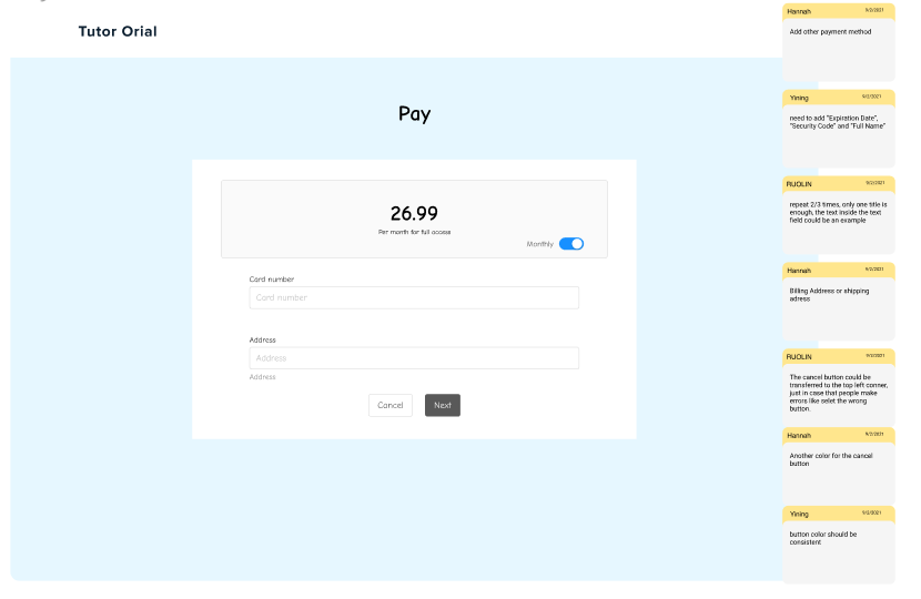
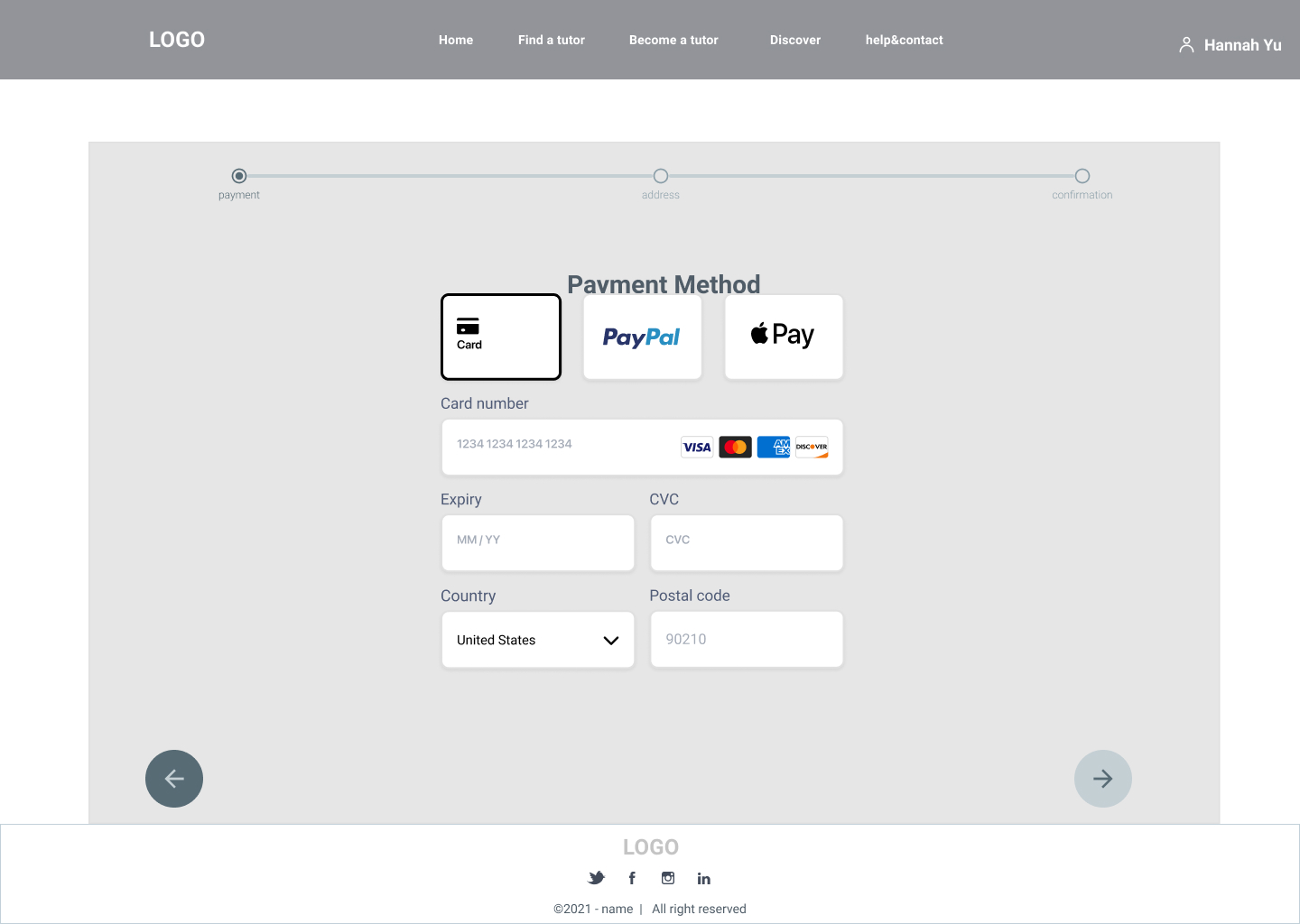
1. Change the payments after the course is selected.
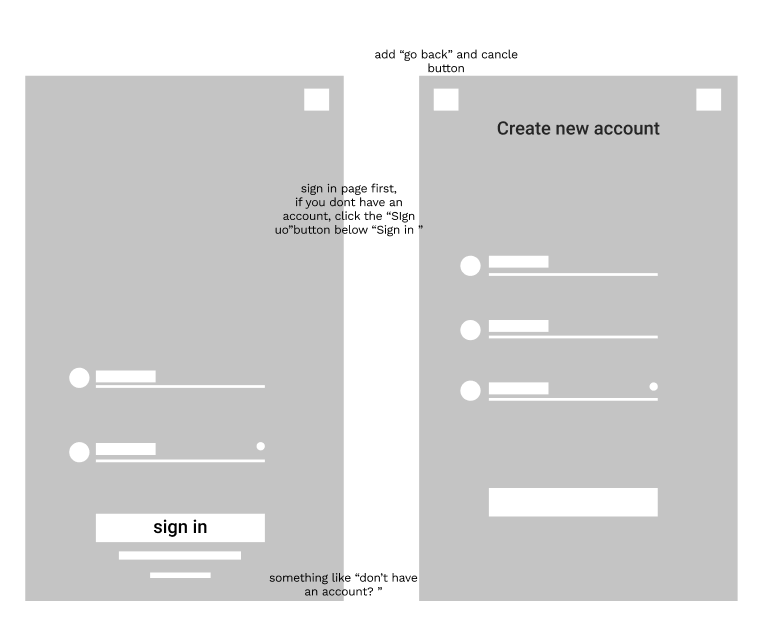
2. Added login page.
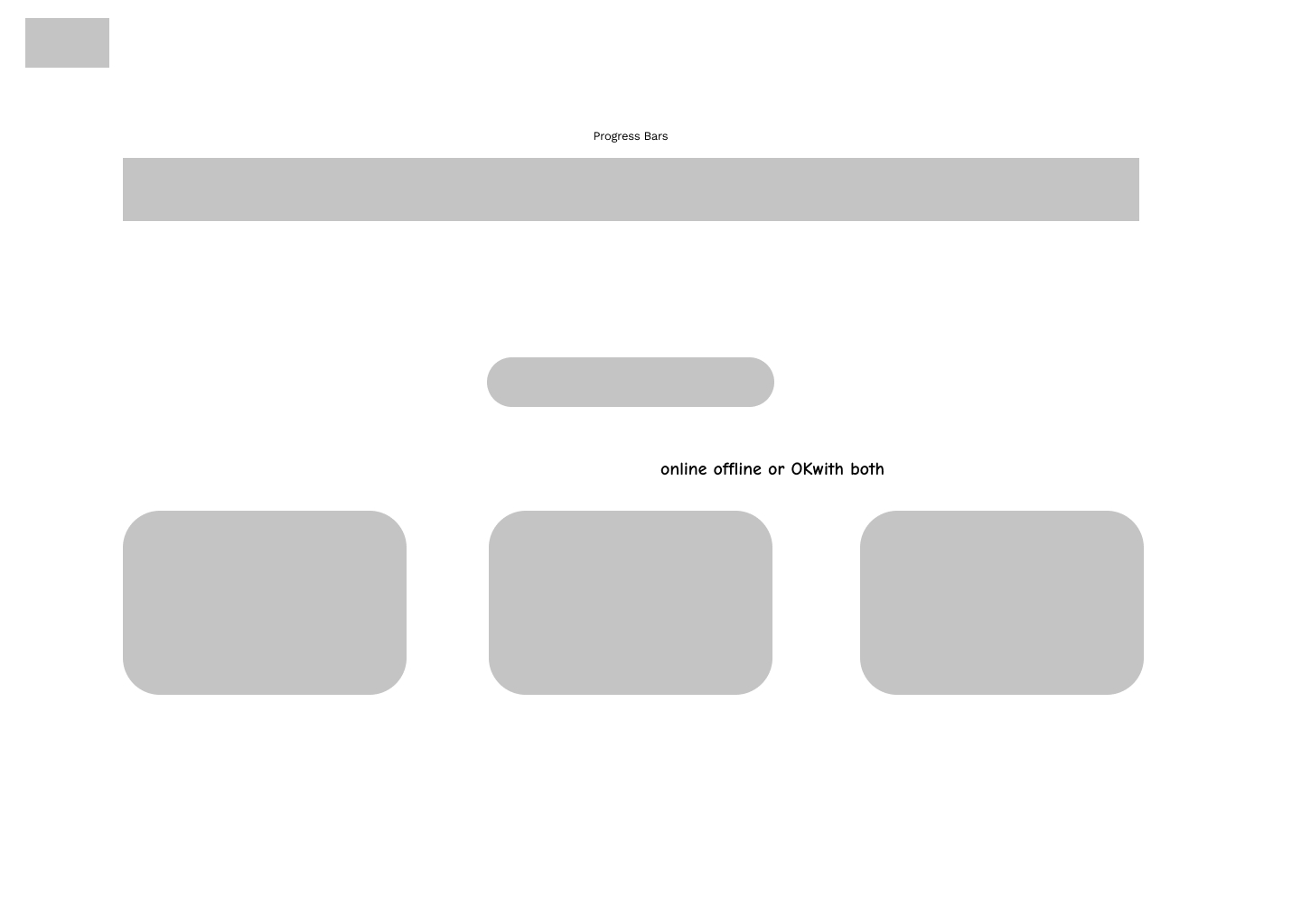
3. Added a progress bar, so that users have a clearer idea of which step they are at.
4. Added tutor details, so that users can understand each tutor more clearly.
5. Added time option.
1. Change the payments after the course is selected.
2. Added login page.
3. Added a progress bar, so that users have a clearer idea of which step they are at.
4. Added tutor details, so that users can understand each tutor more clearly.
5. Added time option.


Direction 2
1. Change the payments after the course is selected.
2. Added more useful and important information to the landing page.
3. Users can fill in the form more flexibly.
4. More detailed information about the tutor.5. Added personal dashboard.
1. Change the payments after the course is selected.
2. Added more useful and important information to the landing page.
3. Users can fill in the form more flexibly.
4. More detailed information about the tutor.5. Added personal dashboard.

USABILITY TESTING
&
SYTHESIS


Synthesis
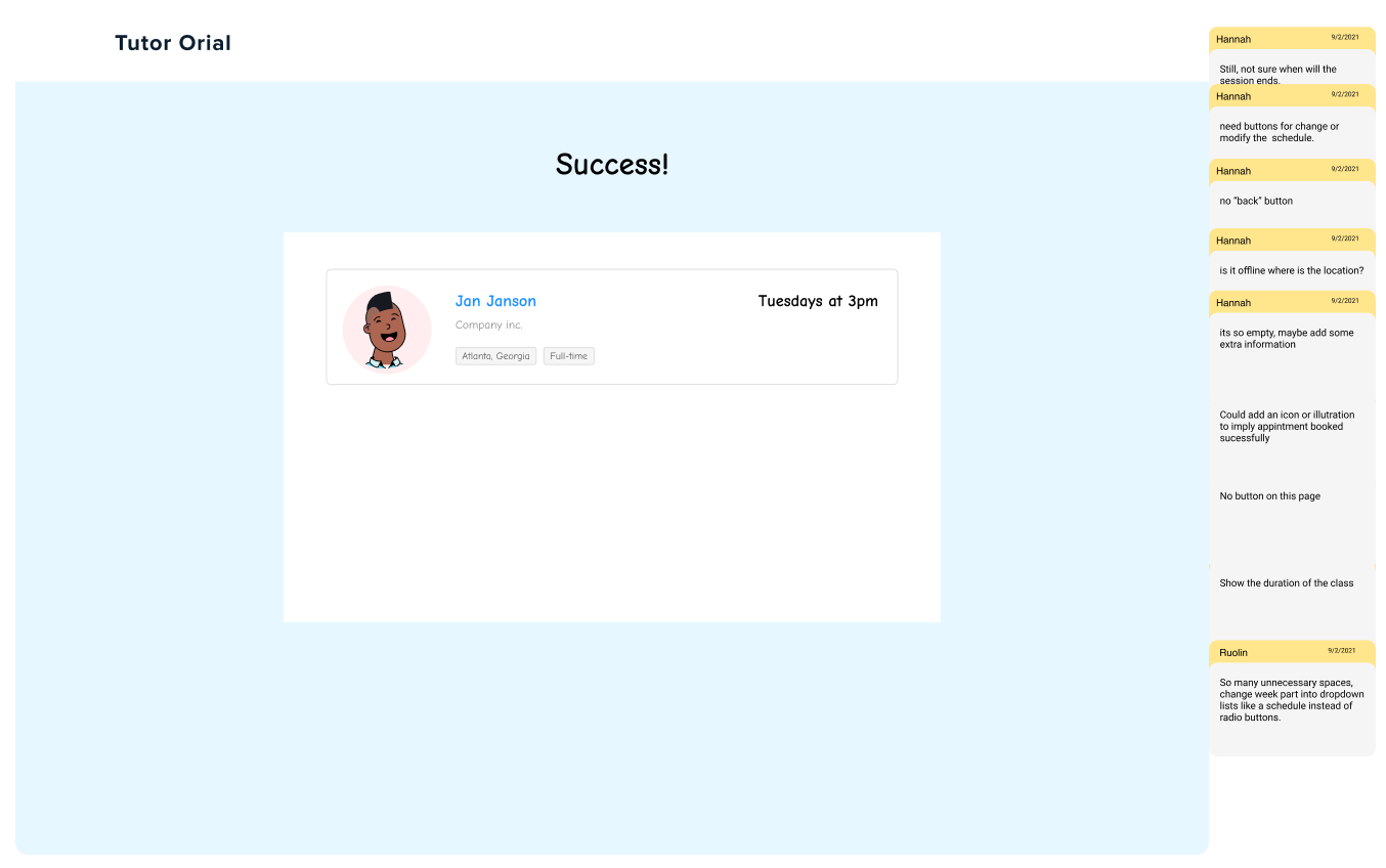
- Everyone likes the second prototype.
-
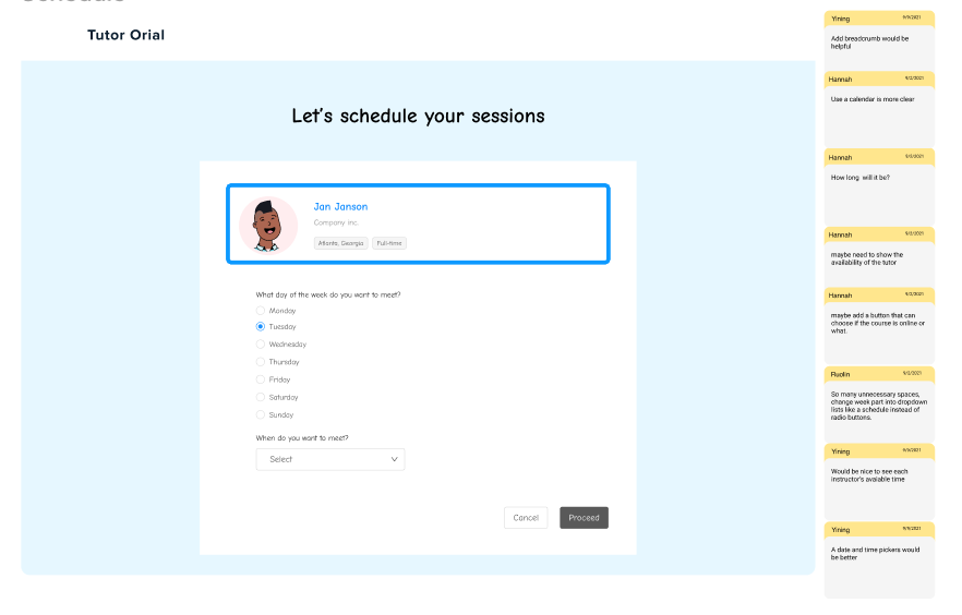
Basically everyone thought that the Date and Time section needed to be rethought.
-
Date and Time picker is unclear.
-
When is available and when is not at all is not clear
- What is the duration of a session? Is there any difference in price for different hours?
Solutions
- Focus on Date and Time Picker
- Add search bar on some pages
- Add information about the price and price compare
HIGH-FIDELITY PROTOTYPE
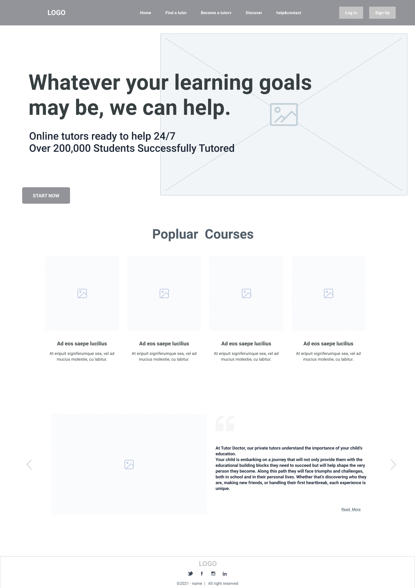
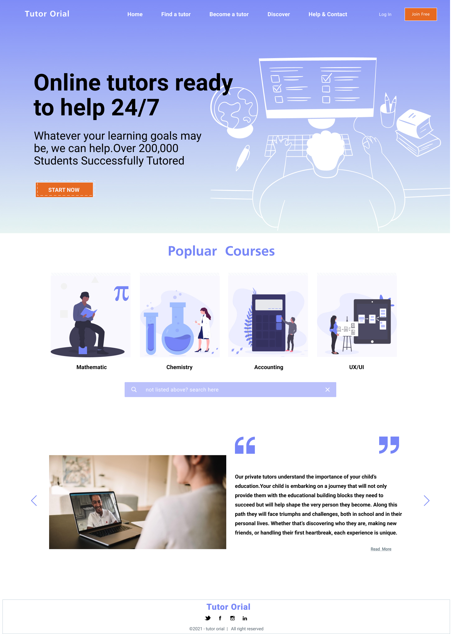
Landing Page
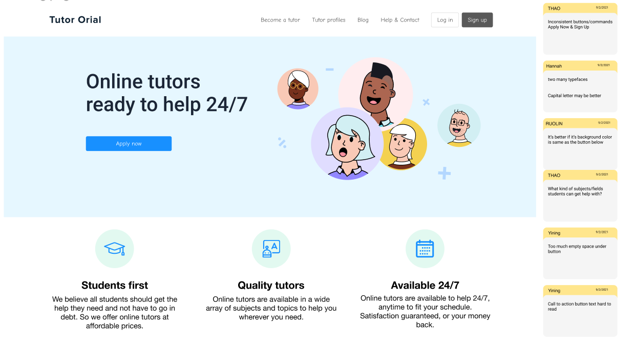
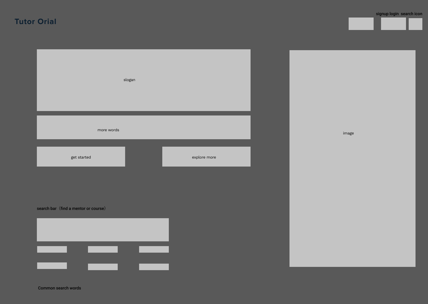
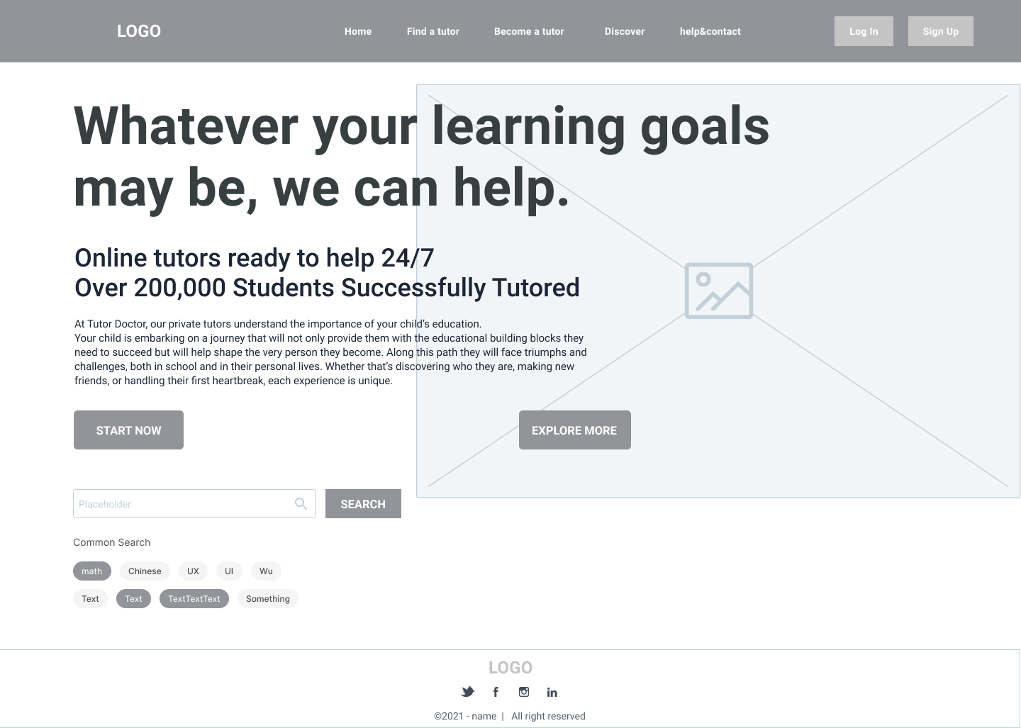
Add the most searched, most popular courses, and a course search bar to make it easier for users to find what they need.
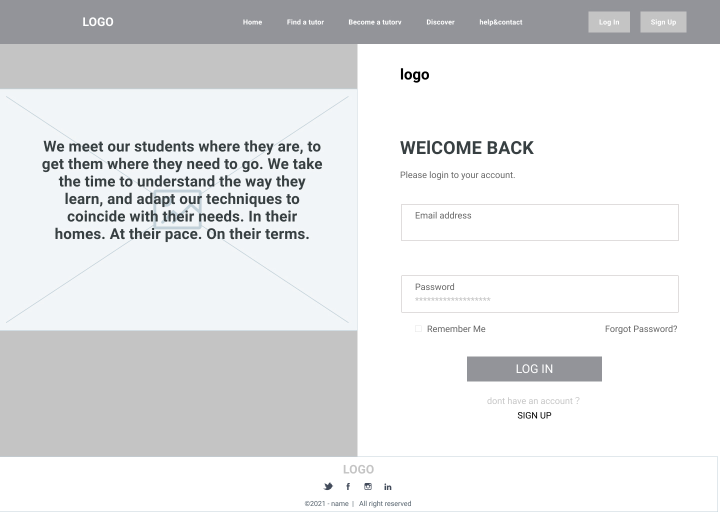
If user click the start button, it will jump to create an account page.
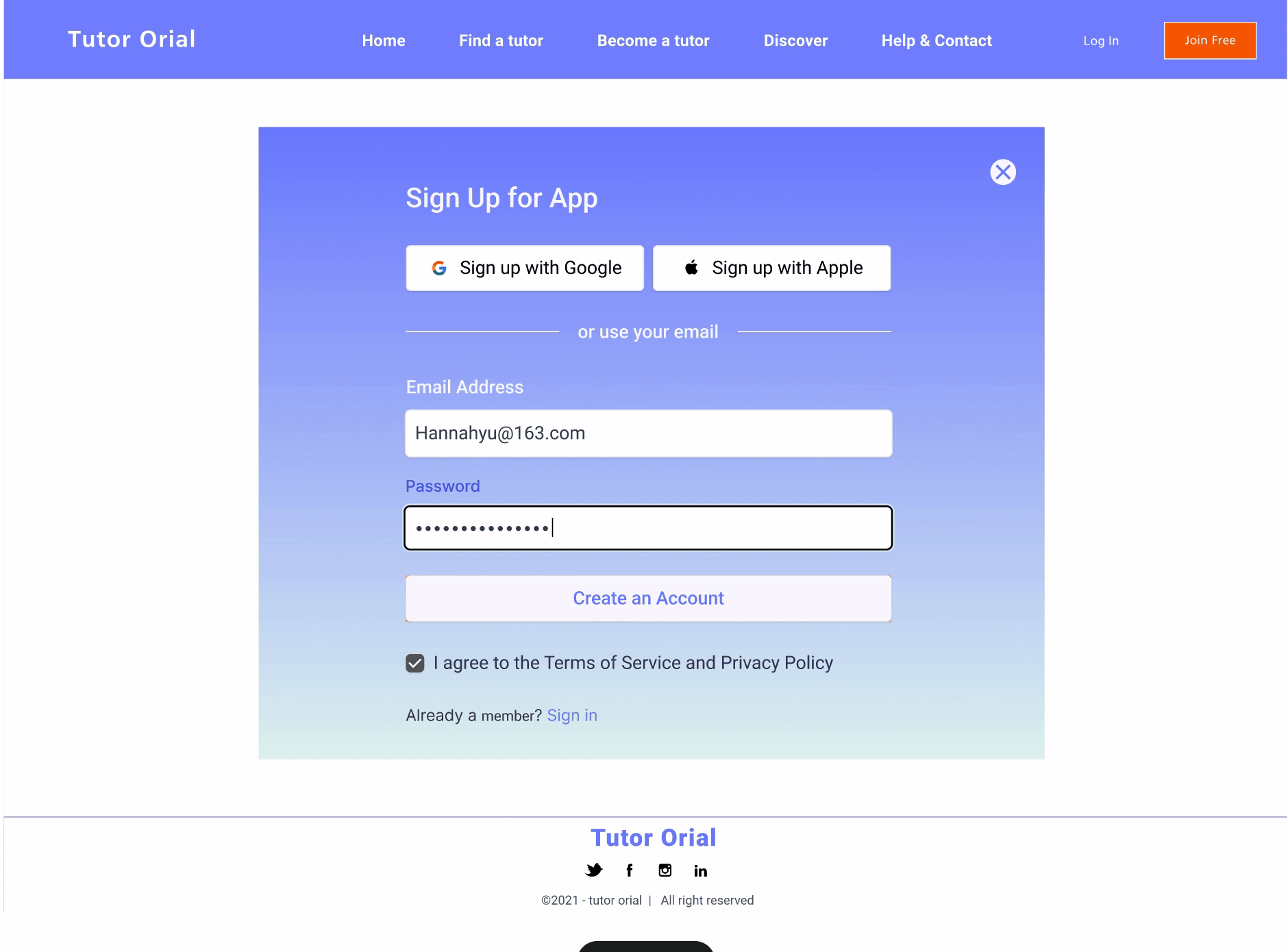
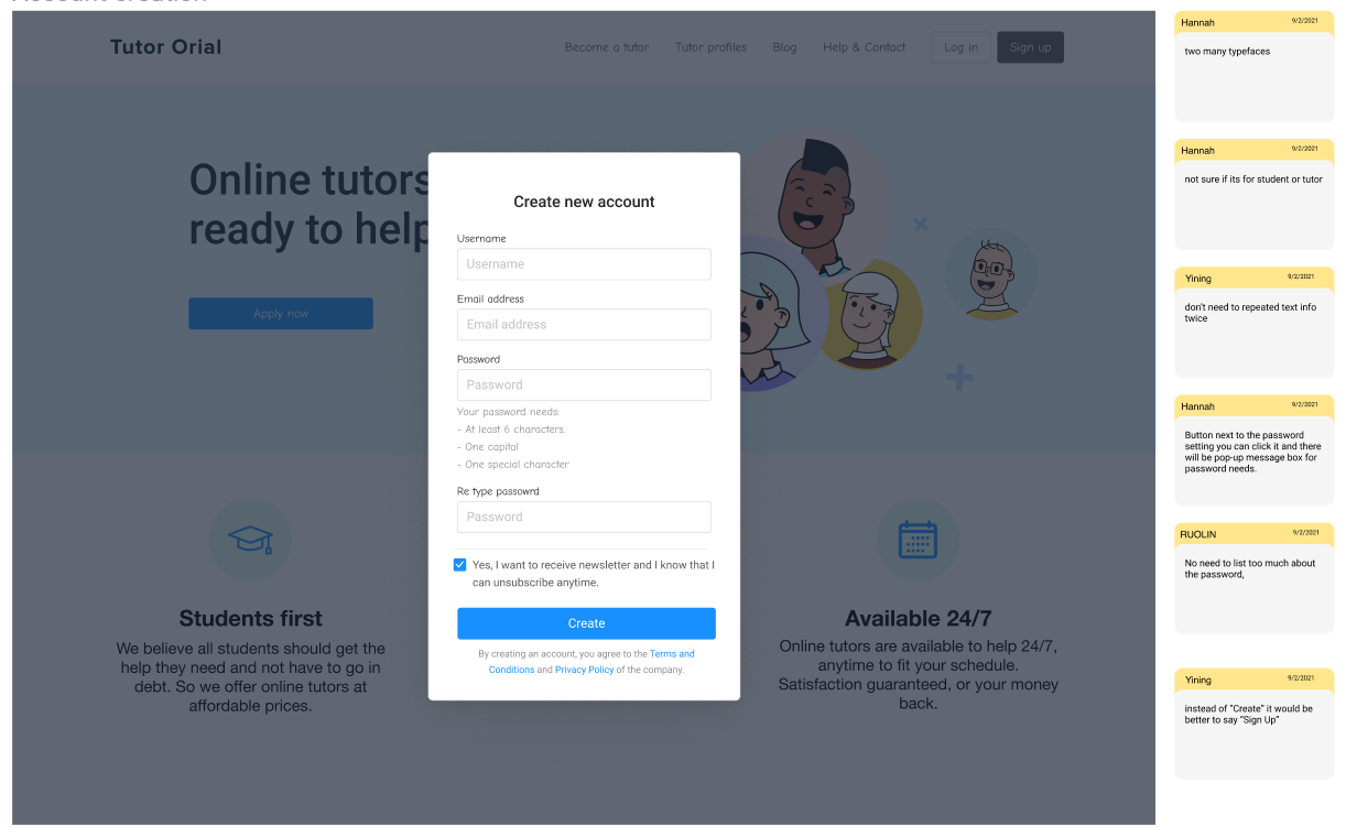
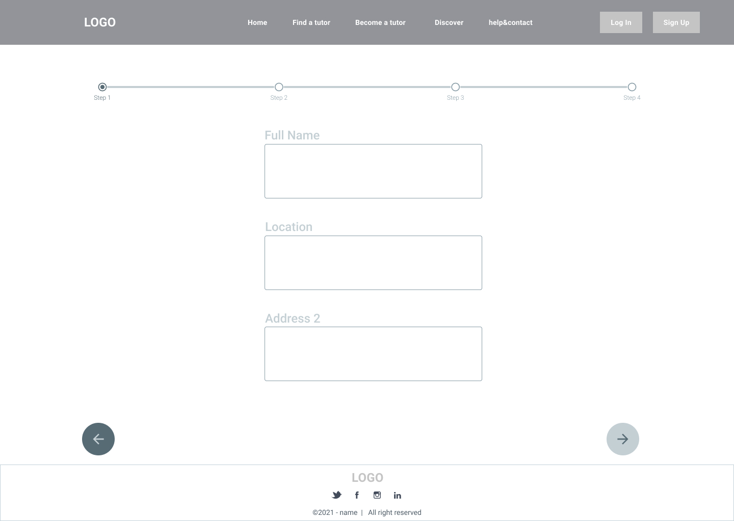
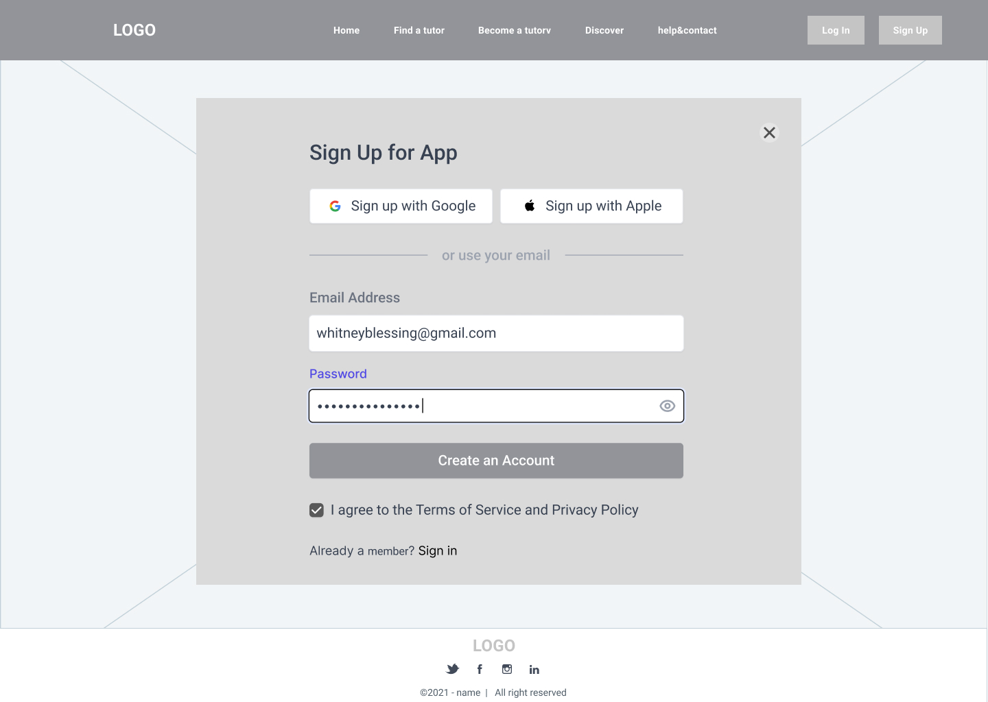
Account Creation & Form
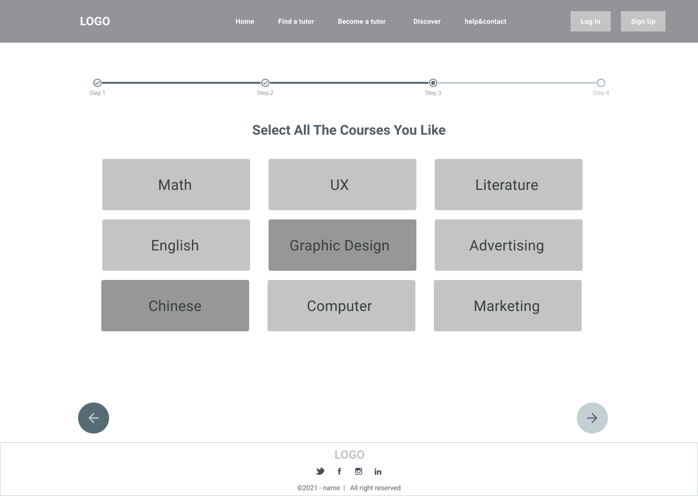
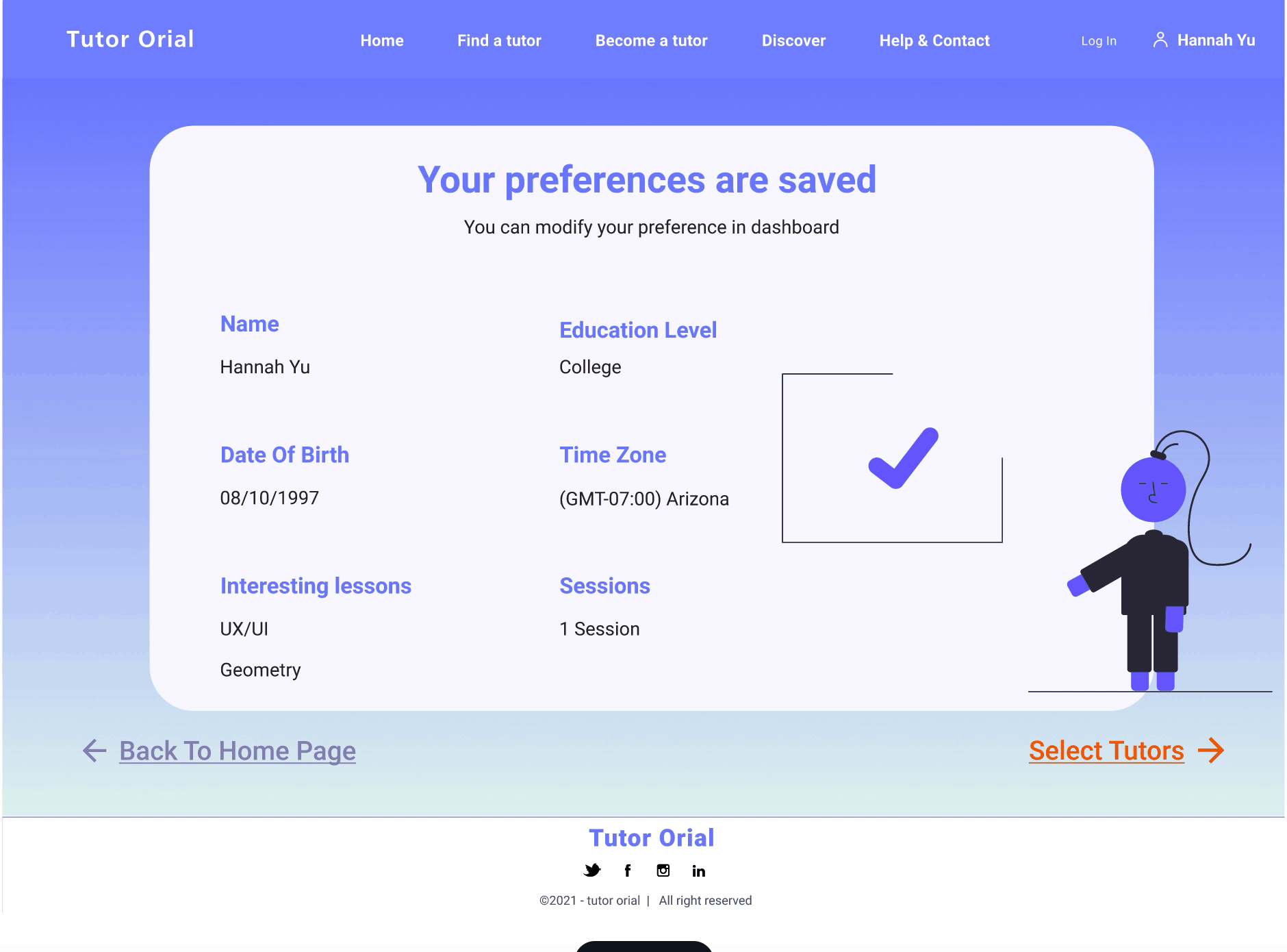
This forms will ask some basic information, next is what subject they what to get helped with, and they can type in the course if its not list above, next is the education level, and then its their time zone, and last but no least is how many sessions they what.
And the next page will show a summary of their preferences,it will show that The questionnaires they just filled out have been save
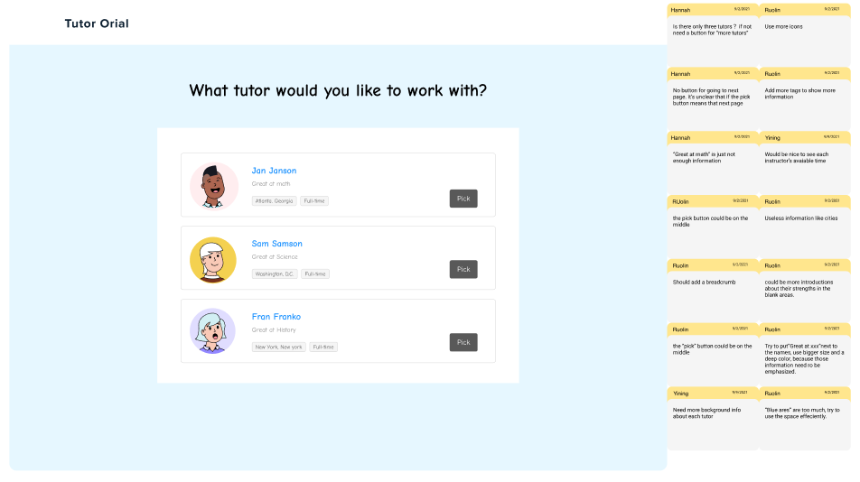
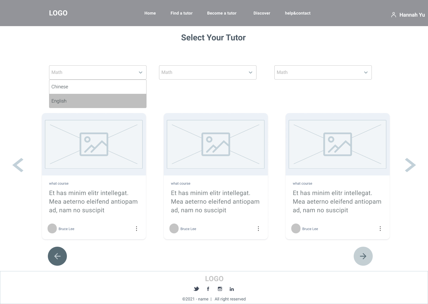
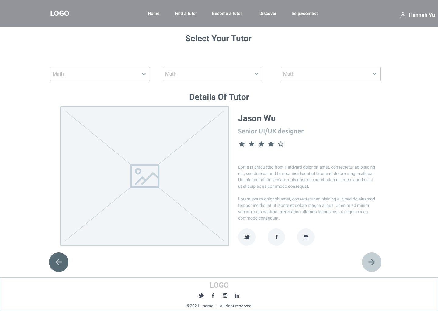
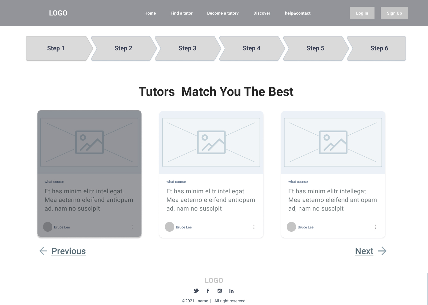
Select Tutor
The next step is to select the tutor, and there are filter words on top that are filtered based on the questionnaire they just filled out, and they can also choose to remove these filter。There is also a search box below where they can search for courses or names.
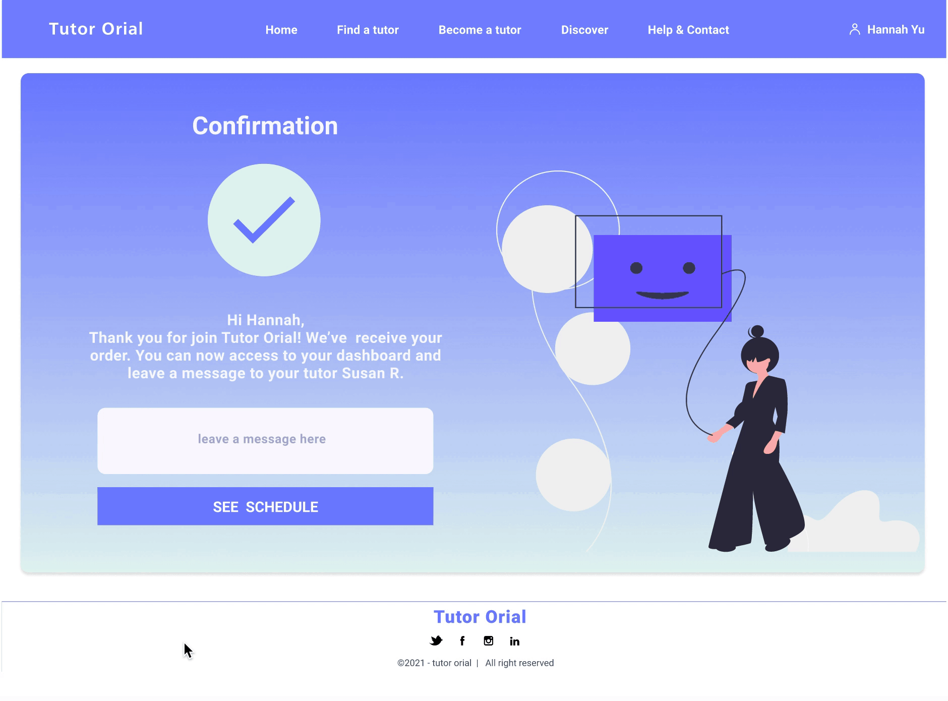
After clicking on a tutor, the details of that tutor will pop up,After clicking on the selection, there will be a price comparison so that they can choose for themselves.
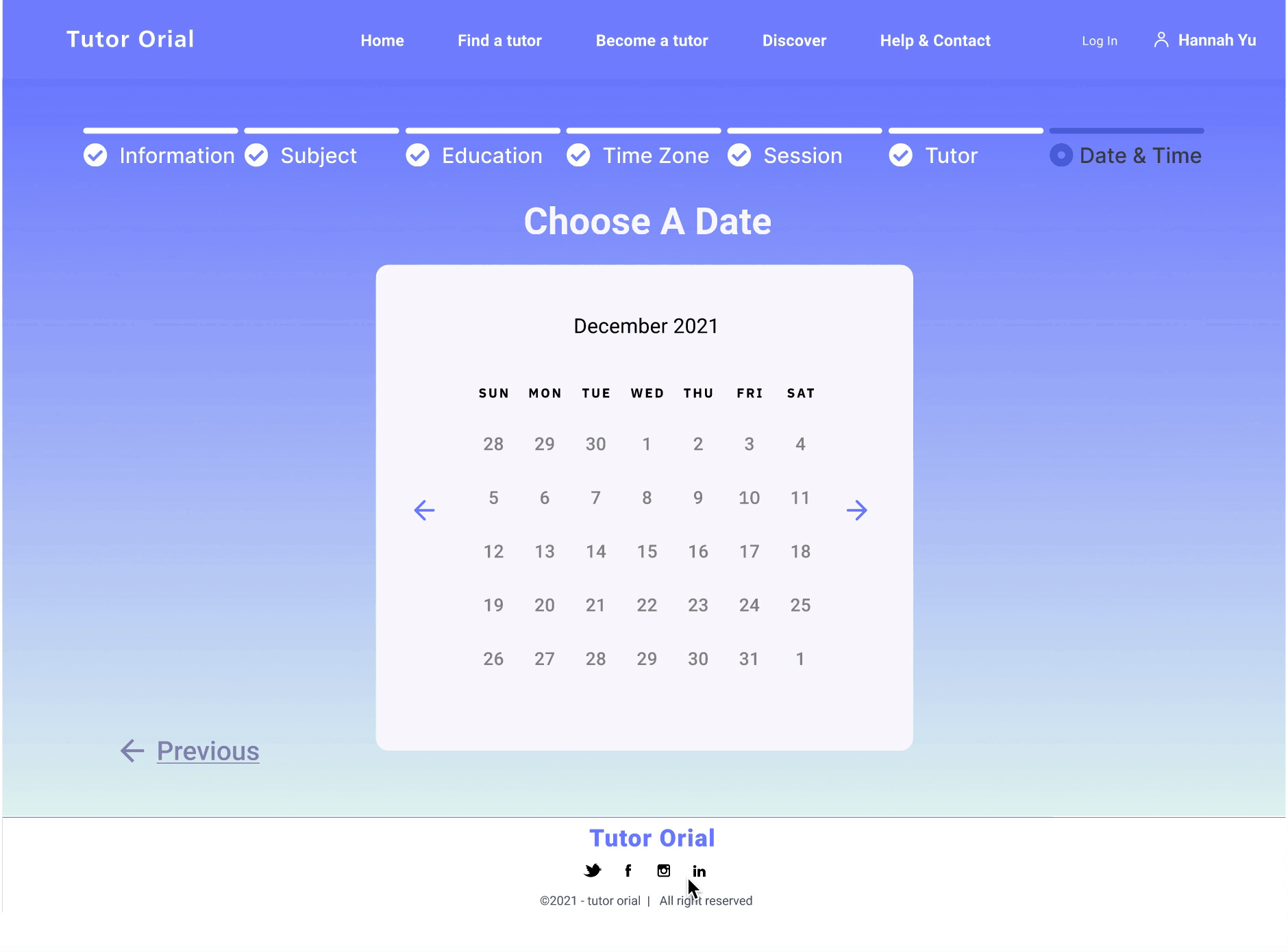
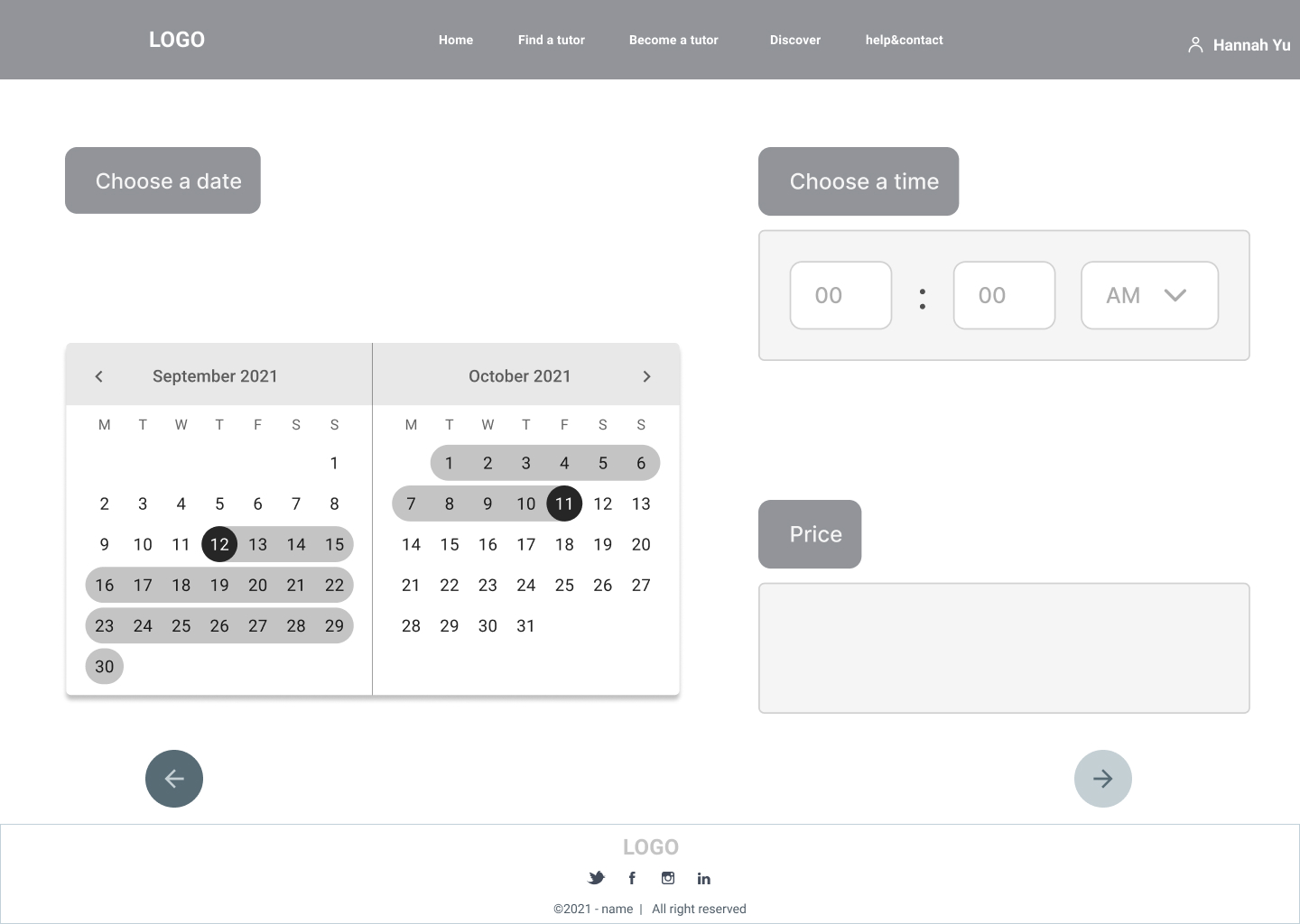
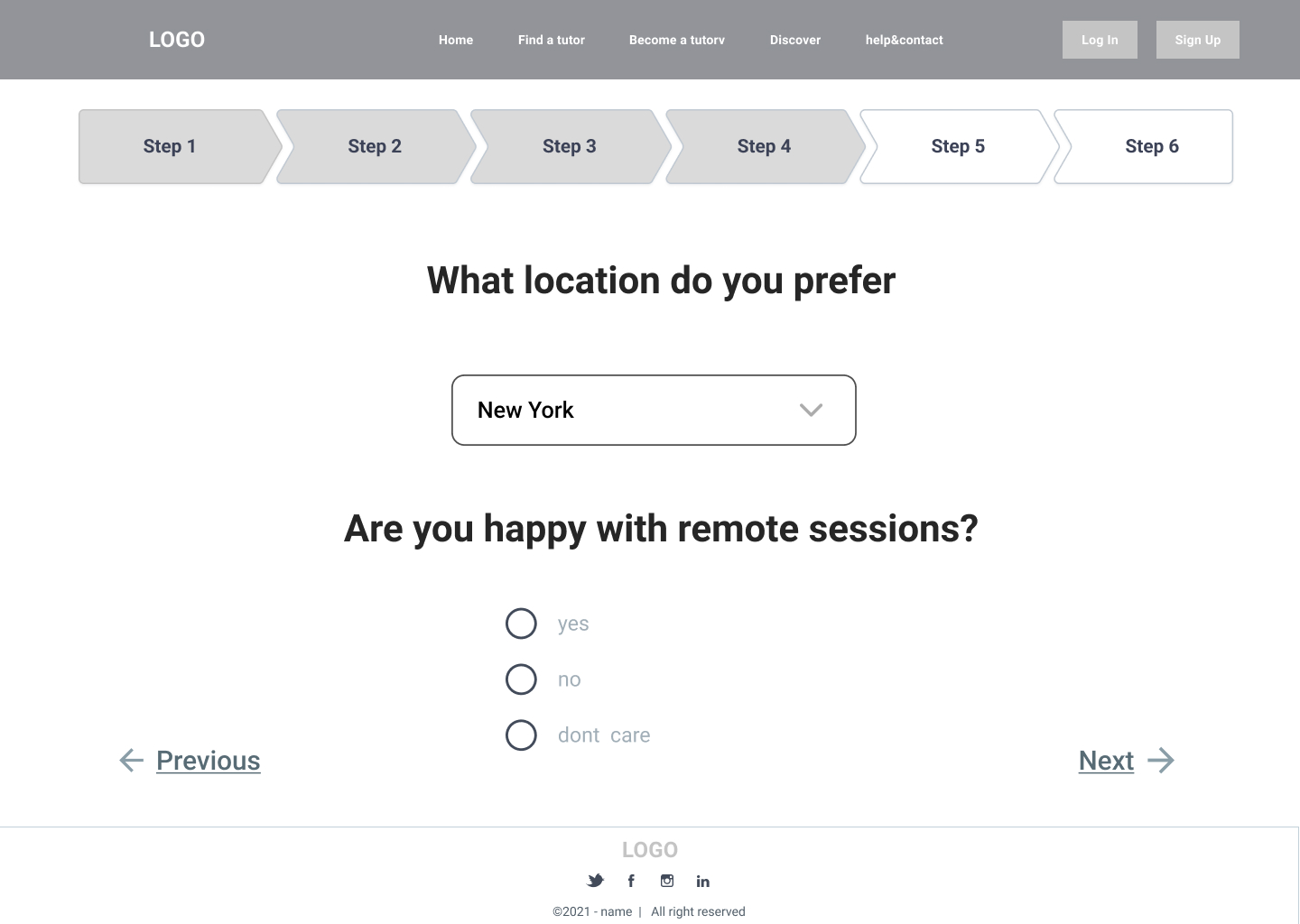
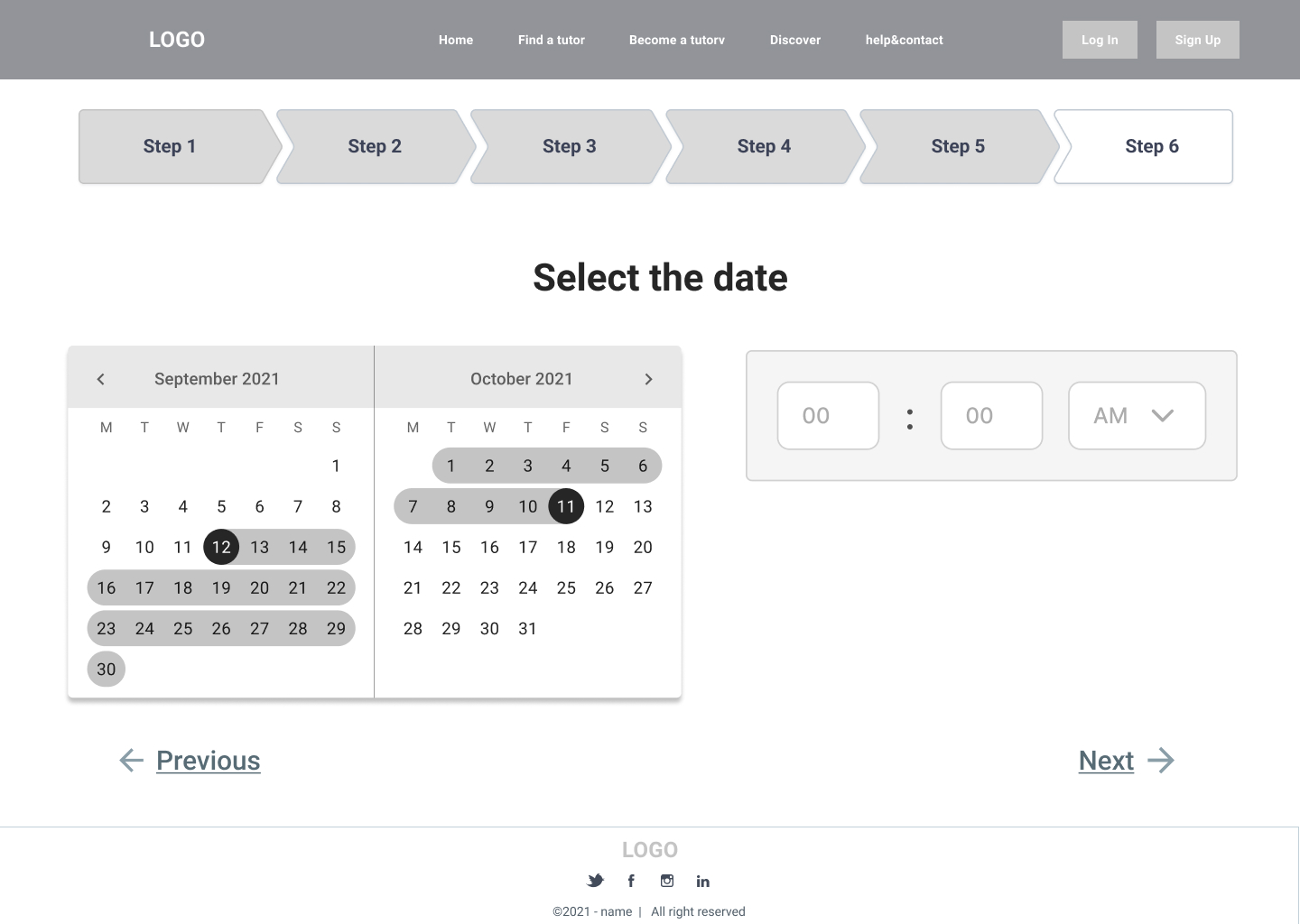
Select Time
The next step is to select the date and time, the first step is to select the date, then the time. When choosing the time if you want to choose another date, you can click the button next to it to go back .
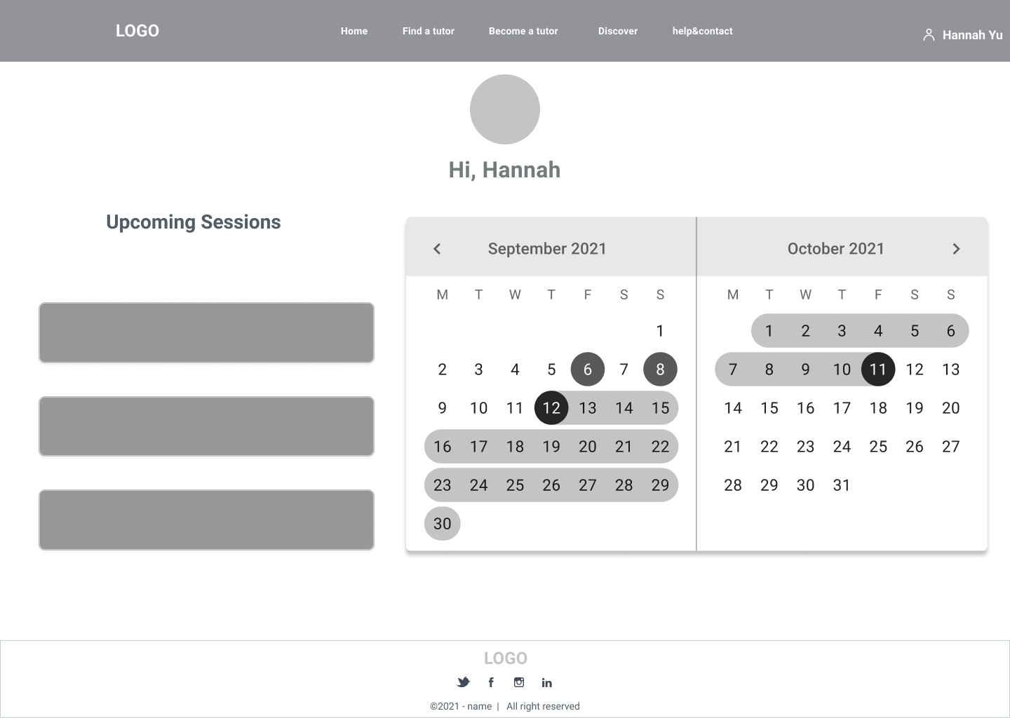
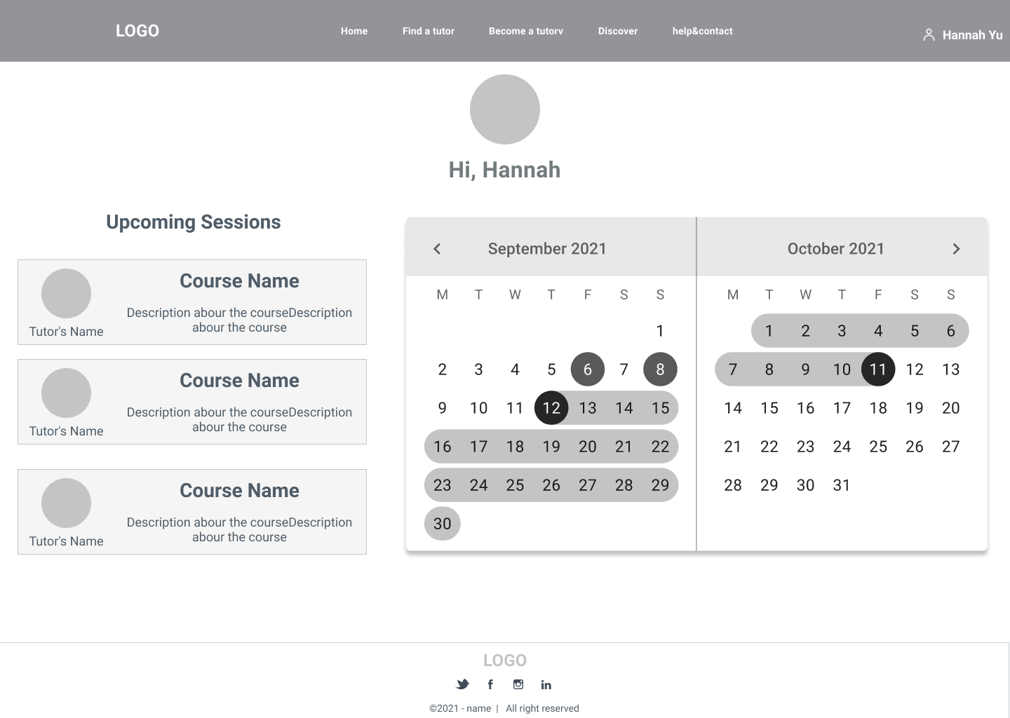
Dashboard
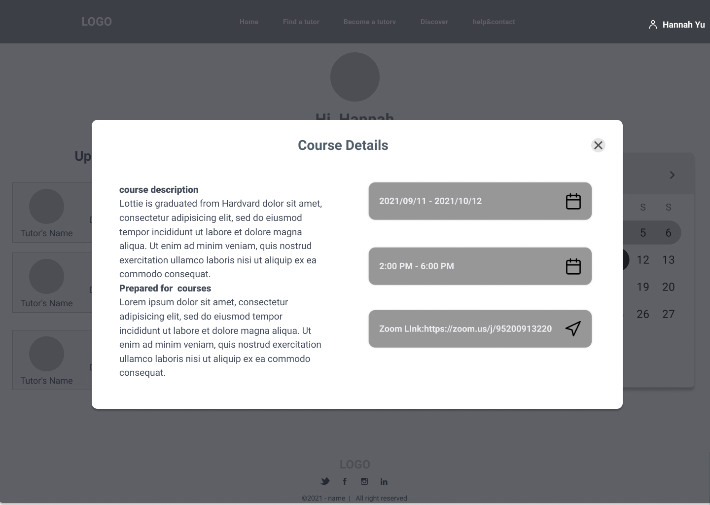
On the profile page, users can easily see the schedule, with different colors to distinguish the different courses. The latest three lessons are listed on the left, and if the user clicks on them, he/she will be taken to the lesson details page, with zoomlink, time, lesson description, and the option to contact the tutor.
SUMMARY
Tutor Orial was the first project I did while studying product design at Parsons.
Since my time on this project was short, I only had the opportunity to interview college students. I would have interviewed more high school students if I had the opportunity, because they were the target group.